Note: I’m not linking ANY product for you to buy…as this is an exercise in learning how to pair what you already own in your closet with what you have but if you HAVE to know where I got something, feel free to leave a comment or email me.
If you want to check out the previous blog on matchy and complimentary colors, you can find that here!
So as I mentioned in the last Style Your Ride post, the level of consumerism in our sport has hit peak…at least peak to this point. Especially with the changes to showing rules for Dressage in the US, the search for new jackets, boots, pads, browbands, bonnets, and so on and so on have continued to exponentially grow. I mean…I’m personally in a large number of matchy groups (in the US and Europe) and a custom boot group…and a jacket group on Facebook. Lord it’s all tempting…daily.
When I started riding…which really wasn’t THAT long ago (13 years) there weren’t a lot of options. I had some crazy colored things I purchased from Europe…but no one at the barn was buying that stuff. Everyone wore black, brown, tan or blue breeches (sometimes gray) for schooling. Saddle pads were all neutrals too…hunter green being the most exciting (unless you were a child and buying pony pads…where you could find some more exciting things like pink). Everyone wore tan or white for showing. Jackets were black or navy or some kind of tweed/plaid in those colors. Boots were black…or brown. Riding shirts varied based on season and colors…and sunshirts were only just starting to be a thing…polo shirts were more normal. There were no matchy sets (other than everything was a similar color scheme so you incidentally matched). There weren’t endless amounts of products to buy…just to get new colors. Lord how things have changed.
So what to do now? We can go around and buy a matchy set for every ride…and end up broke (and looking like everyone else). We can look old fashioned and poor…by sticking with our old school stuff. Or you can learn to curate. It’s okay to buy stuff, if you want it and can afford. It’s not okay to go broke shopping…and if you’re using those buy now pay later things…please don’t. For so many reasons…don’t. It’s also not okay to buy it because you feel pressured to. It’s not okay to buy things you only sorta like because it’s the cool thing. Buy things you like! Then learn to work with them.
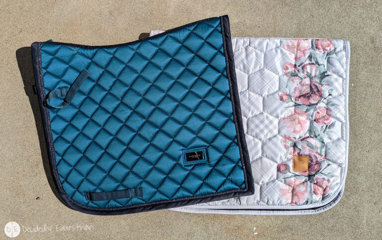
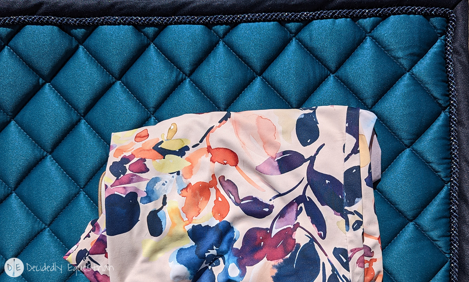
Prints haven’t been particularly cool for a long time of my life at least according to the people in my life. I mean…with fashion girls…yes…but the average human is a little turned off by most prints I think. I know my mom is scared of them. And my husband. I personally have been a long time lover of prints and back in high school was regularly called “homeless lady” by my mom…because she didn’t think my style was really a “style.” I would regularly pair florals with animal prints…or plaids…or checks…or whatever colors I felt like. It’s a skill working with prints. Some people naturally get it. Some people need help…and it can be learned. It’s about balance and complimenting colors and scales. But I’m not going to teach you how to pair a print with a print…honestly there’s not a lot of prints in riding tops that compliment most prints with pads that exist. It’s just not that popular…however I am going to teach you how to incorporate a print into what you have already. I’m going to use this gray plaid pad as the main example, but I’ll mention a few others as well.
Before I get into it, I will note that there are some prints that will be harder to match to your existing wardrobe depending on the colors contained within. If you tend to buy soft purples and pinks like I do…or rich blues…a pad that is orange, yellow and blue isn’t going to be easy to work with for you. Same for something that is mint green, yellow and burgundy. You probably aren’t going to be attracted to the prints that have colors you don’t enjoy, but sometimes you are! Just be warned when you’re buying prints…if you expect to work them into your existing wardrobe you need to have a look at the colors you have in your closet already.
The first and major rule of working with prints is…they’re actually more forgiving and more versatile than solids. What? Yup. In terms of creating a complimentary look…prints are the best. Why? A more obvious range of colors to work with. This pad at first glance is gray and pink. However, it contains a LOT more variation than that that gives a lot of wiggle room for pairing it. Let’s have a look.
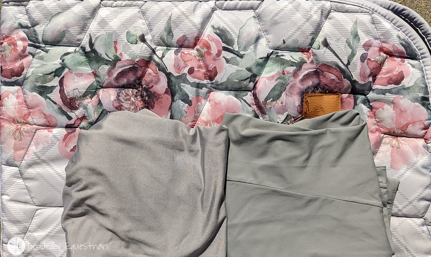
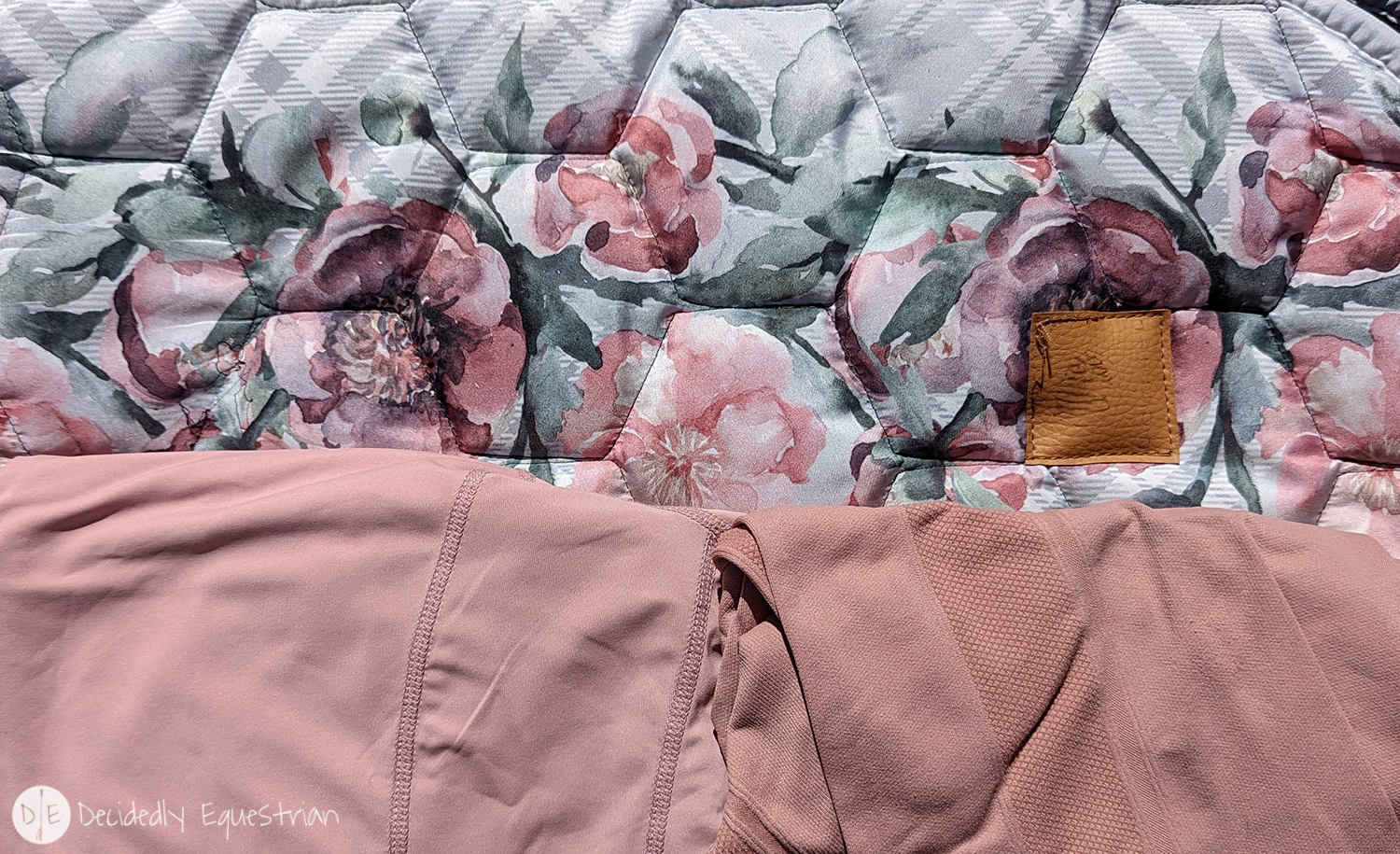
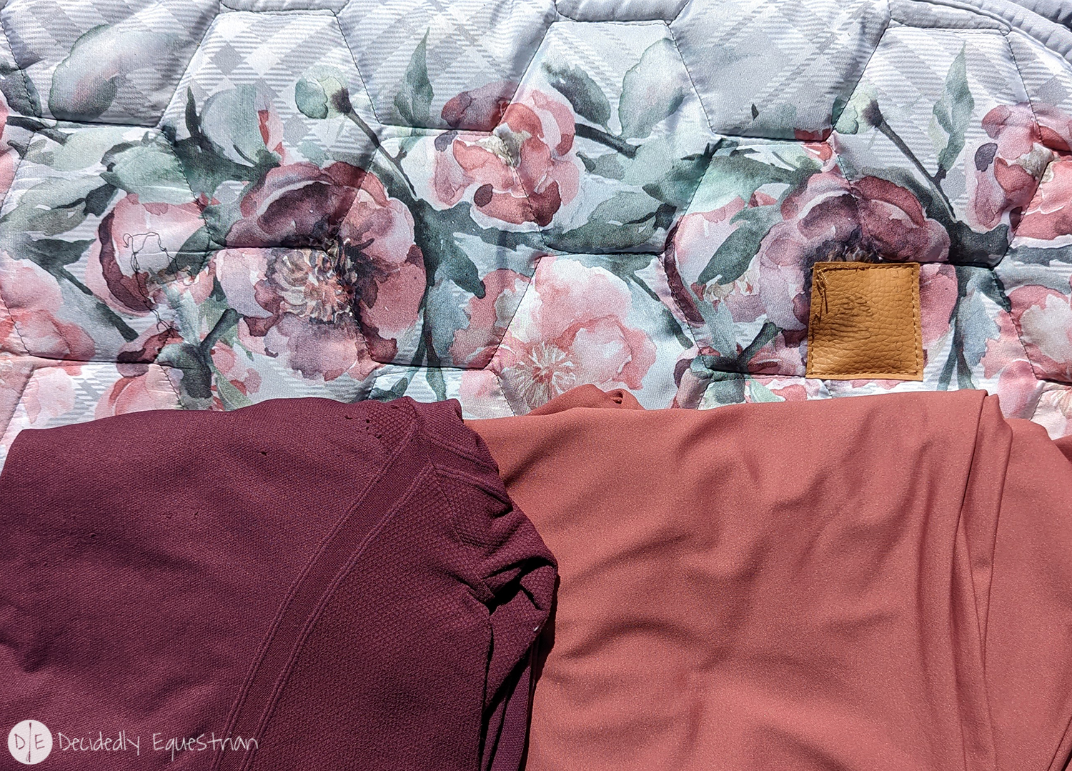
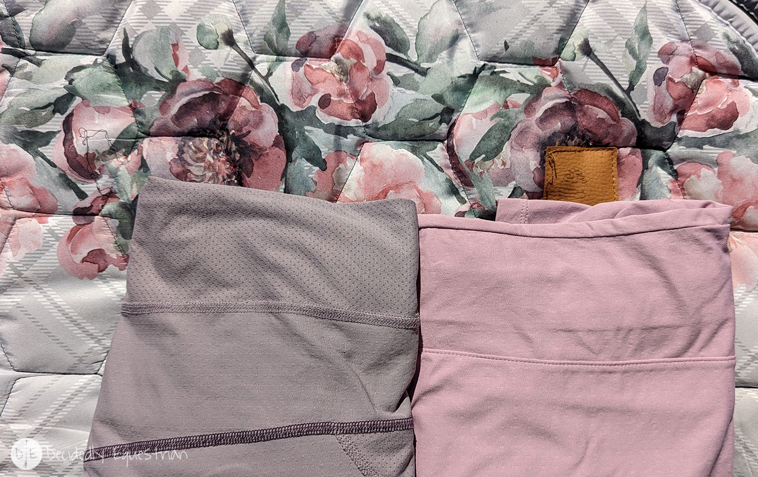
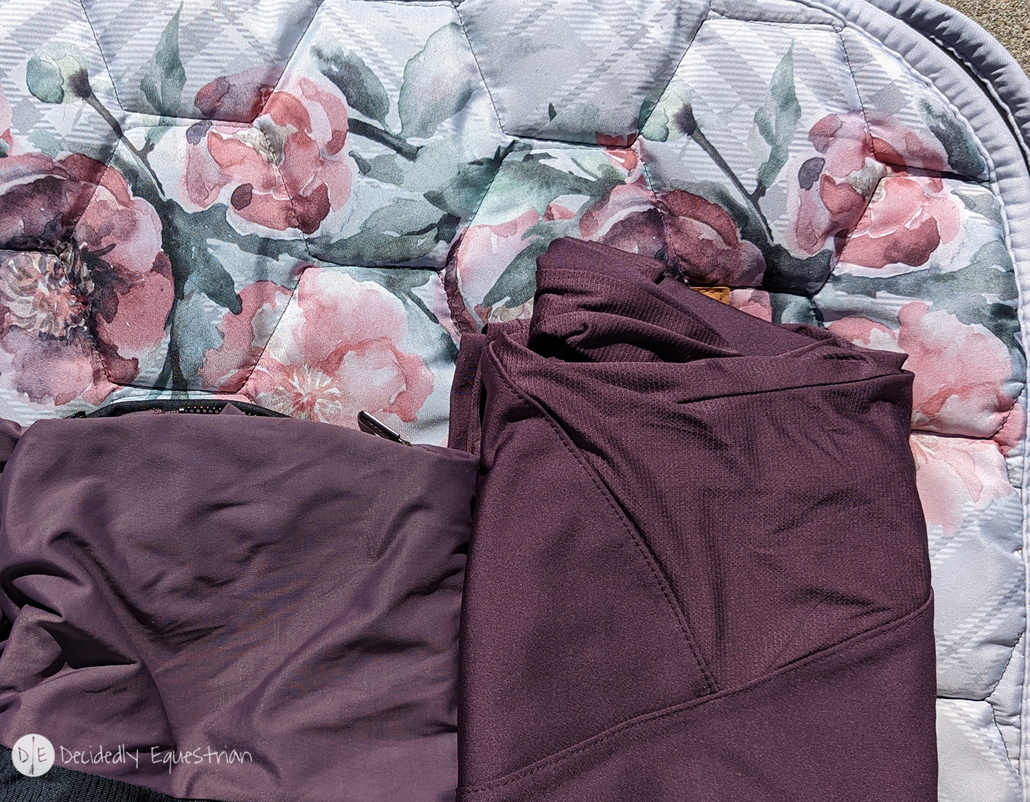
So…without even going into the range of greens…I’m showing you 10 different sun shirts in my collection that work with this pad. That’s 10 days of matchy outfits…with one pad…without having to buy extra anything. To be honest I don’t actually have any green shirts to show you…why? No idea. I haven’t bought any…which is bizarre because it’s a good color for me and Jax…but maybe it’s just not as popular for shirts. I do have several pair of green breeches…which I always pair with this pad. I select green or gray breeches for this pad with one of the complimenting shirts. It leaves me with almost endless options. So we learned today that a print pad is a super useful item to have in your riding style. If you see a print pad you love, buy it. Don’t be afraid of the print because you’re not sure what to do with it.
This doesn’t just go for pads, it also goes for tops. If you tend to be a little chunkier on the bottom, a print shirt is your best friend (paired with a dark pair of breeches, it will make you look more balanced). If you’re thin it doesn’t matter…buy anything and everything you want (congratulations!). If you’re trying to hide a big chest, perhaps don’t venture into the realm of print shirts. If you want to emphasize what your momma gave you…go for it! There is a super popular brand of riding tops that has some really stunning prints. However I see a lot of people buy them and then only pair them with black or navy or another basic color. You don’t have to do that. Take the same tricks as above and look at the colors within the print.
So there’s some easy tips to incorporate print into your schooling pads or shirts to bring a little more excitement to your everyday style. If you hate prints (how did you get this far reading this article?) or are not sure how to work with them I hope I’ve helped you to be more willing to work them into your style.
While I’m not trying to sell you any of this stuff, if you have a question about a specific item featured here, don’t hesitate to ask me. Also if you need any help finding things to work with prints you love, I’m just a DM or email away! Have fun with your riding style and go play in your closet! Sometimes just breaking up the normal “go-to outfits” into a slightly new arrangement is all it takes! You can be social media level stylish on the daily without major effort or spending!