Note: I was going to include a print pad in this one…but now I’m going to do a separate blog on that in a few weeks as this one got a little TOO long. Also note I’m not linking ANY product for you to buy…as this is an exercise in learning how to pair what you already own in your closet with what you have but if you HAVE to know where I got something, feel free to leave a comment or email me.
So I’m not going to be political with my words here…I’m going to speak the truth…you and I both know that EVERY company out there selling something is trying to get your money. They aren’t your friends (except when they happen to actually be your real life friends…but that’s not what I’m talking about)…so don’t give in to the hype on social. There are a lot of EXCELLENT marketers out there that are fantastic at making you feel like you’re part of a group…and you are. You’re part of a group that buys their stuff. HA! But don’t misunderstand the purpose of what is on social media for businesses…their goal is to part you from your money. We all KNOW this…but sometimes it’s good to remind ourselves.
We also all know that the current environment on social and many barns is to look good while riding (and why not! I love looking great while riding). I personally have upped my spending on saddle pads and riding clothes since Covid started…because my expenditure on my everyday clothes went WAY down. No longer am I shopping to look good at work or social events…now I have focused my money into products I will use regularly…and that’s my horse stuff. It’s totally fine to spend your money where you want it…however…when the market is so predatory it is good to remember…it’s just stuff.
So back to the topic at hand…matchy! So matchy matchy is 100% a marketing campaign that is playing out VERY well for a number of brands and retailers selling those brands. I remember when it started several years back. Why just buy a new shirt? Buy a saddle pad that matches! And maybe some boots…and a belt…and some breeches (note: if you’re buying matching boots and polo wraps…make sure you’ve read the research and you’re using the right thing for your horse rather than trying to be pretty…I no longer buy either of these products). You can see how any new release you happen to like can rip apart your pocketbook (especially with the super aggressive limited edition marketing tactics a lot of these companies use). Not to mention a pad (just a regular square pad…no fancy shims or foams or anything) I saw teased recently that I wanted that ended up being $155! Yes. One Hundred and Fifty Five Doll Hairs! Seriously…it better ride for me at that point. I DID NOT buy it. I spoke my opinion on the price by not opening my wallet. I appreciate a few brands dropping prices (nod to Equestrian Stockholm here for this Aurora Blues pad drop which is why I bought it) or selling off old stock at major discounts because their product is overpriced anyways…but some of this shit is getting out of control. And…besides that…in my normal real life style I’m a “I’d rather drop dead than wear a matchy outfit,” kind of person. I like prints. I like color. I like contrasting color. I’m not Queen Elizabeth. I’m not Kim Kardashian. I’d rather look like I’m walking off the set of Gossip Girl (either the old or new one lol). So why am I falling into buying the matching outfit?
That plus the recent purchase of two releases from Equestrian Stockholm I didn’t really need…(but must admit love both) made me start rethinking my purchasing, and I want you to rethink yours. Is matching all it’s played out to be? How cool can it be when you go to the barn and everyone is matching…and most of you have the same sets? I almost always get more compliments on my barn style when I’m NOT matching…but choosing complimentary tones instead.
So matching is easy…I get it. Buy the shirt. Buy the pad. Use the breech color they use in the marketing photos. Done. However it’s also boring. And expensive. I have dozens upon dozens of riding tops (I mean…it’s a LOT)…and while my pad collection is large, I have more shirts than pads by quite a bit. Which is how it should be if you don’t use a different pad every ride (I wash my pad after 3 rides). Do I buy three matchy shirts per pad (absolutely not)? What happens when a shirt or pad wears out? What do I do all those other time’s I’m not matching perfectly? I go for complimentary colors! I happen to benefit from a fine art education (all the way through graduate school…so useful I know!) and I know how to put colors together…but I know many people do not. Today I’m going to show you how you can do it with what you have. I’m going to do a series of these blogs with color options for various pads I own, but I hope in doing this project I can get you to learn a bit about color theory and help you to create some of your own beautiful outfits.
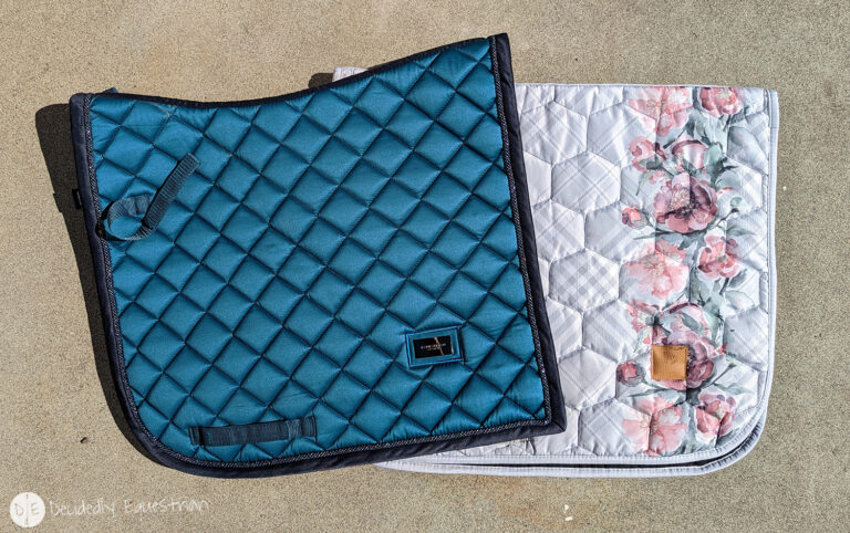
First off, the internet is a huge source for everything on planet earth. You can find literally anything and it is a perfect tool here. For instance…take the Equestrian Stockholm Aurora Blues set. You may not know what to call the color. Is it teal? Kinda…but not quite. You can look up teal on Google and see the color isn’t quite right, but it is certainly helpful if you know something more specific. It is in the scale of blue-green. I call this color (and so does PSOS) Petrol. Petrol isn’t a color description used in the US a lot, but you’ll find it used in Europe more. It’s like teal…but it’s more blue than green and it has a little gray or brown in it.
So it’s helpful to have that name…Petrol…but you don’t need it necessarily (which I’ll teach you in another blog). Now go to google and look up “Petrol complimentary colors.” You’re going to see a bunch of things like this.
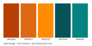

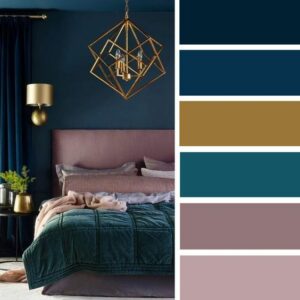
Okay so lets analyze this a little bit. You can see the blue varies a tad from color chart to color chart…but there’s some themes. Rose pinks and mauves seem to be a nice compliment. Also gold (or yellow or chartreuse leaning yellow) and orange which makes sense…with those being opposite on the color wheel from blue. Also notice the brown that looks VERY much like the new ES Amaranth color? Funny those were released back to back…coincidence? I think not! Follow up those with pink October and it should be pretty clear to you that Equestrian Stockholm has a pretty good handle on color theory…so why aren’t they mixing outfits for you….hrrm…anyways. You see navy pops up too. Also note that the colors have a similar either brightness or grayed out base to them. That’s important in your color selection as well. If you pair two colors together that SHOULD work…but they don’t…it’s typically because of the purity of the color (any additions of white or black or brown into the base color) isn’t quite similar enough. Take these ideas and go to your closet and see what you come up with. Here’s what I’ve come up with that works with Aurora Blues. It’s a lot. I have more than a few outfit options for this pad, which will likely make it one I use a lot. I typically pair this pad with black, navy or gray breeches. I’m going to stick two to major colors for this one, but once you have more skill at color combinations, you can easily grab three (say petrol rose and gold), but know it’s going to take some time to get to the level you can feel confident with a mix of colors.
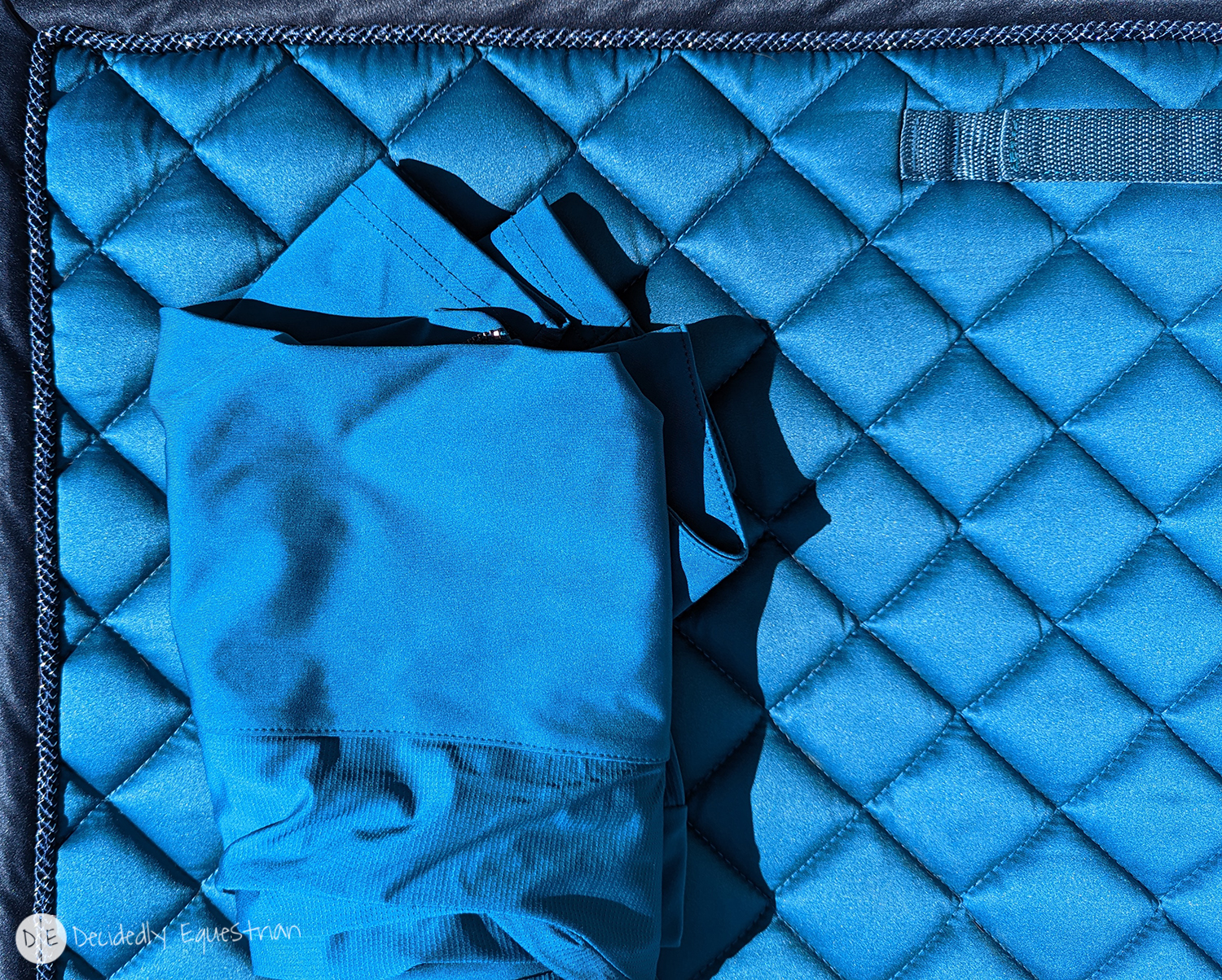
Note: the pad photographed more bright blue than it is in real life (I’m going to blame it on the shimmer in direct bright sun). Know there’s a touch more green in it and it’s not such a royal looking blue as it’s coming across here.
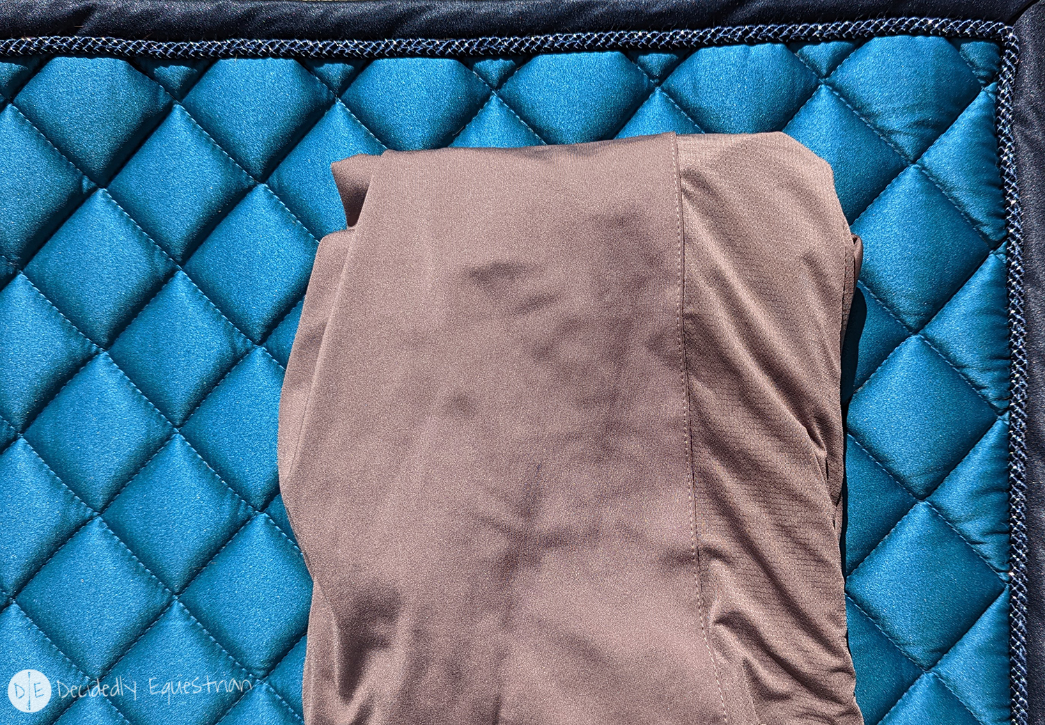
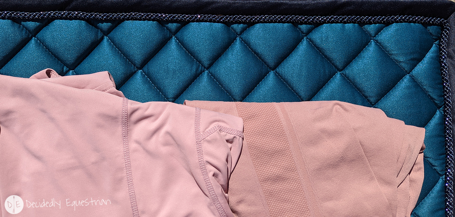
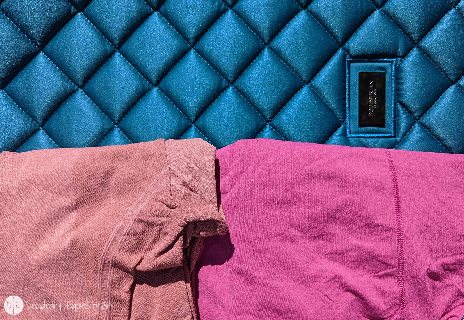
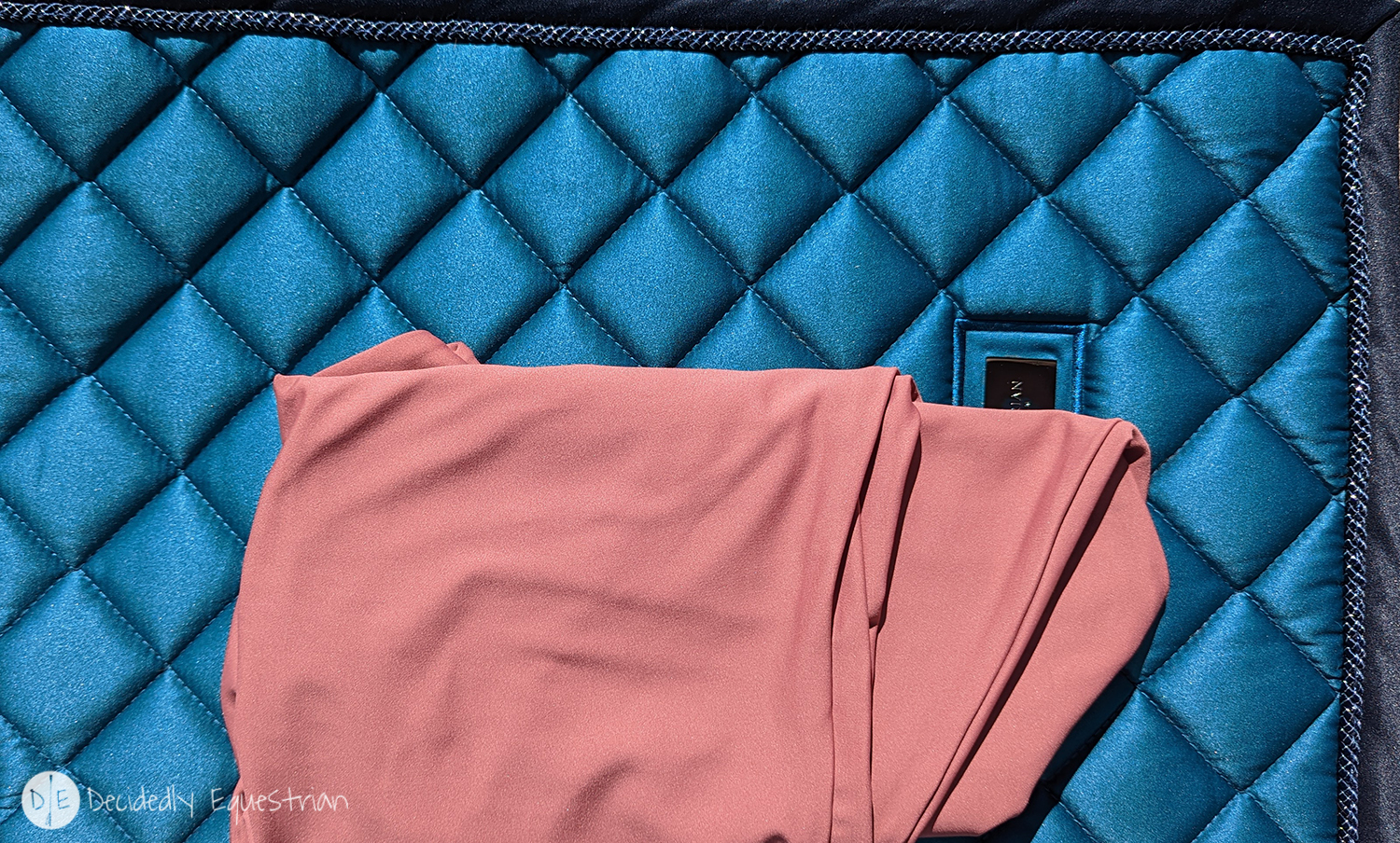
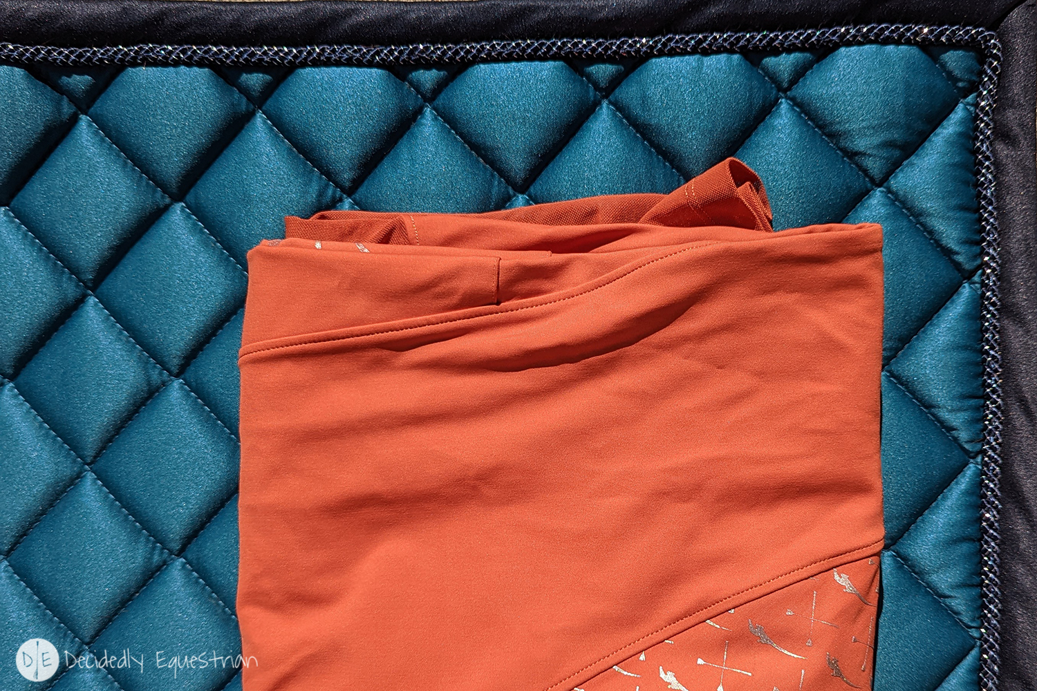
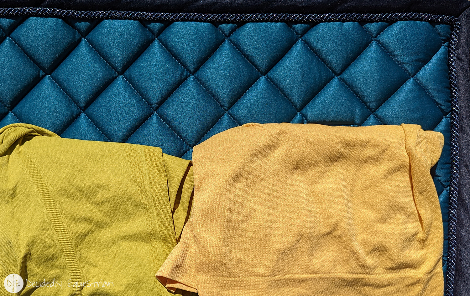
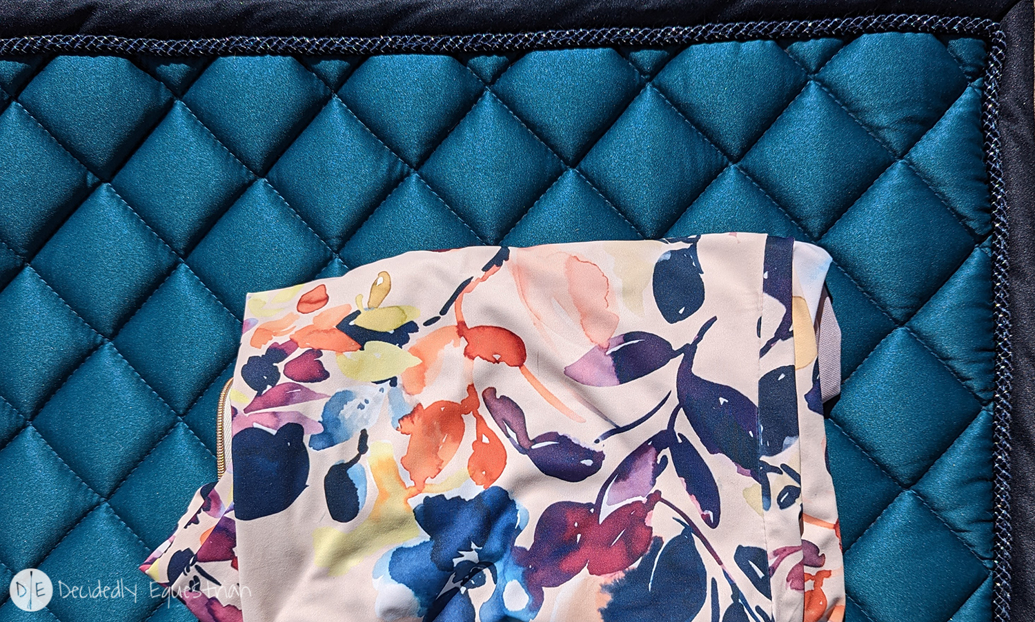
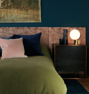
Note that all of these color selections (pinks, peaches, roses, mauve, orange, rust, terracotta, yellow, chartreuse, cool browns) are going to look very pretty with any blue pad. If you have a Navy pad, try some of theses colors. If you have ES Monaco…ditto. The biggest thing to remember is not all tones of colors are going to work with each other depending on the purity of the colors. Play with pastels, pure tones, jewel tones, grayed out tones, browned out tones and see what plays together visually the best. Get in your closet and do some exploring and have some fun creating your own UNIQUE outfits rather than going for the matchy matchy that makes us all look exactly the same!
See you on another day to talk more about prints!